4 Features Missing From Android Auto
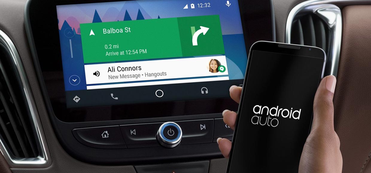
Google introduced Android Auto back to Google I / O 2014, but this product first appeared in real cars only in May 2015, when Hyundai added this OS to the Sonata model.

If you look at the Android Auto of 2015 and compare it to the current version, you will see very little difference – Google is slowly developing this platform, very rarely adding new features and improvements to it. On the other hand, this indicates that work on the system is underway, but at the same time, most users are badly missing some of the functions. Today, let’s talk about the four most missing.
Accessory Support
In your car, for certain, there are buttons that can control Android Auto. But what if you could add more? However, for the time being, car owners have to resort all the time to use the touch screen, hoping that in new car models designers will add more buttons and switches that can interact with Android Auto.
If third-party manufacturers of accessories could produce their own gadgets and accessories, then consumers would be able to place additional controls wherever they like. Technically, you do not need anything supernatural, just a Bluetooth accessory.
Better Integration Into Vehicles
For navigation inside Android Auto, touch buttons are used at the bottom of the screen – phone, home screen, navigation and so on.
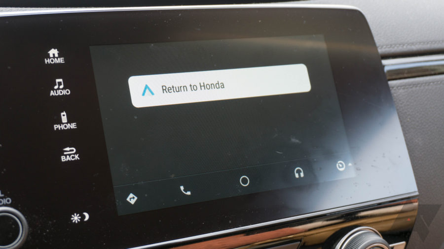
A significant part of the right half of the screen eats up a tab that could display information about the car. But in reality, it can not, since the launch of Android Auto in this section is only the function of switching to the standard multimedia system of your car.
And with 100% probability on the central panel of your car already has a separate physical button for the same switching, which automatically makes this functionality of Android Auto absolutely useless.

It would be much more logical and convenient to view on this tab information about fuel consumption, tire pressure, the need for servicing and other similar things. Yes, the usability of Android Auto is far from ideal, but let’s face it: 95% of the automakers own multimedia systems that even cannot be compared to the product from Google.
Using your phone as a keyboard
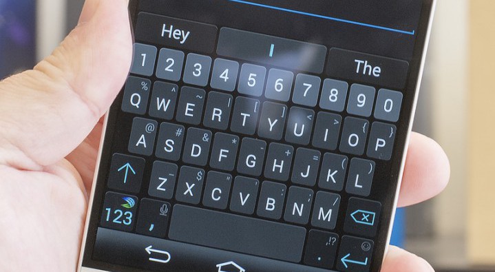
In most cases, text input by voice is a very convenient solution – but obviously not when you are offered a normal set using the touchscreen of a car. Google has already added the ability to manage Auto via a smartphone, so why not let the driver enter the desired data (messages, destinations, search in the library, etc.) using a smartphone display?

Yes, most likely, for safety reasons, developers would make this option active only at the time when the car is in place (for example, in a traffic jam or on a parking), but this method would still increase the accuracy and speed of text input.
Better Music Support
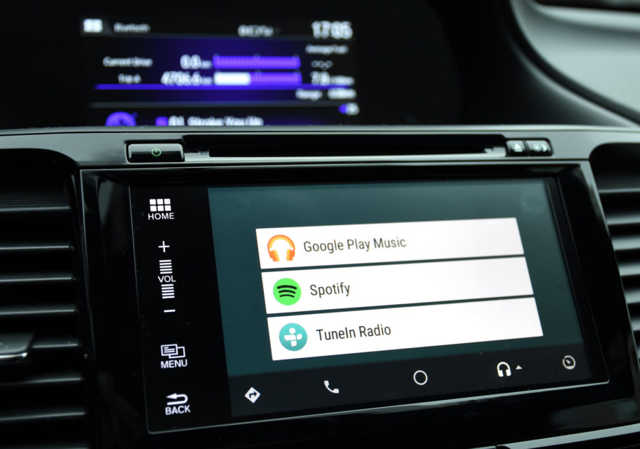
Android Auto can turn on the music you want by voice request. But the implementation of this feature is bad since the first versions of Android Auto.
The voice recognition engine does not always understand complex words and also responds to words that occur in the search query, which serve to activate certain functions (for example, “CALL on me” or “OPEN your eyes”).

Surely you already might have thought that Google cares about you and does not want you to type in the car. Generally, Google does not want you to type in a moving car.
In Maps, this scenario is played out as follows: you stand still, enter the location you are interested in, and when you move, the keyboard is removed from the screen. Google, why not to do the same in music apps?